Published on: 18/02/2016
Updated on: 25/07/2024
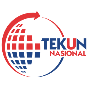
LOGO DESCRIPTION
Color
| BLUE |
Unity in realizing the goal of TEKUN Nasional |
| RED |
The commitment of members of the organization towards the success of the vision, objectives and corporate values |
|
SMALL RED AND BLUE BOXES
|
The small boxes in the design represents the many entrepreneurs who have successfully obtained funding from TEKUN NASIONAL fund |
| U ALPHABET
|
The ‘U’ alphabet represents the entrepreneurs (usahawan) who have received loans and guidance from TEKUN and achieved success in their business ventures |
| THE GLOBE FORM
|
The shape of the globe in the design means that TEKUN entrepreneurs are capable of growing their businesses with the support of TEKUN NASIONAL towards becoming more viable, competitive & resilient |


